Supper Co.
Website
Art Direction & Design
Web Development
Copywriting

After a year of creating stand-out work for clients under the lean branding of Supper Co., it was time to turn the focus inward and create a showcase of the agencies’ work that was as kickass as the work itself. With a bold color scheme, new illustration badges, and clever copy drenched in midwestern hospitality, we did just that.

As an agency, Supper Co. exists in a service space, which provided ample opportunity for the parallels between food service and hospitality. Without being too “on the nose” throughout the site and the brand we infused our messaging with the intention to invite our clients to our table to break bread with us. We danced the line of bold creative and warm hospitality to communicate that the relationships would be warm and personal while the creative remained bold.

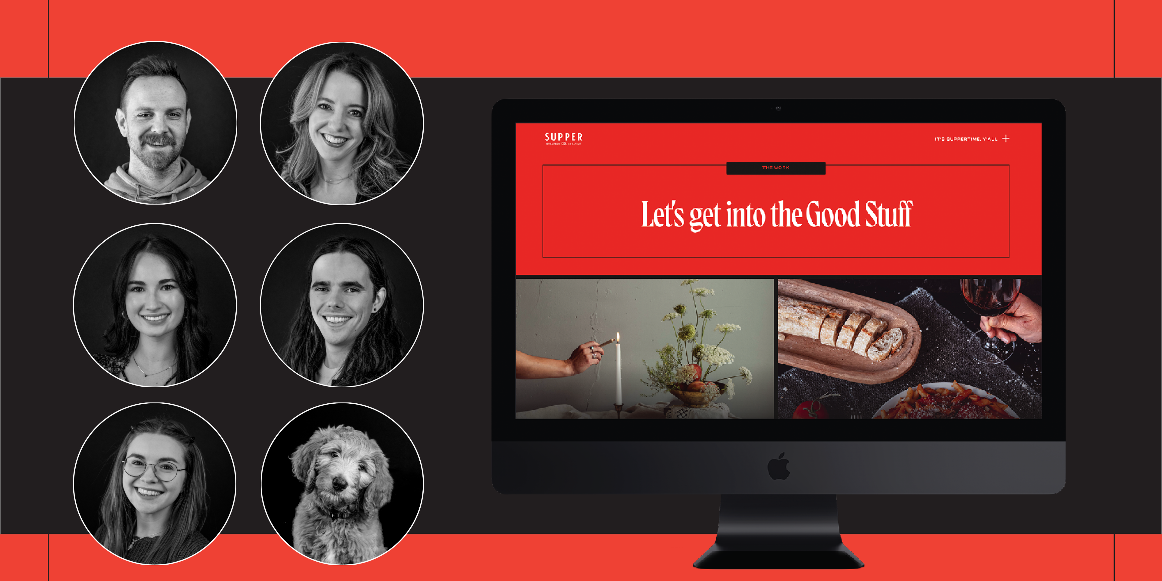

The star of the show for any agency is always the work, both strategic and creative. While we wanted our brand to speak, we always came back to leading with the work. The case studies were built out in a way that would showcase the work while providing space for the strategy and returns of the work to speak. The intersection of strategy and creative is where Supper Co. really shines.


